Task 8: Evaluate the Adverts
M3 (U20): Explain how the created media components comply with the codes and conventions of the media sectors
D2 (U20): Demonstrate how the technical and aesthetic properties of the media components meet the client brief
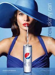
I looked into some adverts to get some inspiration as to how we can create our own and what kind of elements we should include. I looked into well known drinks companies and their adverts in order to see how they lay out their promotional material and what we can use for our own ideas. The first company was Pepsi. We can see that there is a large image of the actual drink in the middle, with the logo beside it. Of course, we don't have to copy this exactly, but we want to make the actual can the most noticeable element of the advert.

 For the magazine advert, I followed a similar idea. I wanted to find out how Pepsi would lay out their magazine ads in order to take ideas and apply them in our magazine advert. I came across this one which I thought looked good. This is because there is a can placed at the bottom of the page in the middle, helping to make it the main focus of the advert. The background is then there to make the advert more interesting than just a can on its own, something that we wanted to do with our adverts.
There are a number of ways that I can learn or take inspiration from real media products. From researching many different forms of advertisement throughout this project, I have learnt about the conventions that companies use when promoting, which has helped me to gain an understanding of what I would need to include within my own products. For example, in Task 1 where I looked into Nike and Coca Cola I found that the use of slogans are key to advertisement and so I knew that this needed to be included within our advertisement because it was clear to me that they are used in order for the message to stick in the audiences mind so that they can associate that one line with the company. Something else that can be learnt form the advertisement is that I need to stay consistent with the message, colour and style of the products. Coca Cola for example would include images of the product in each form of promotion (Billboards, Posters, Magazine ads etc), which is important because the target audience need to be able to see what is being promoted by the company, and what they are getting helping them to decide whether or not they should they go and pay for the products.
The other aspect of media products that I have been able to take inspiration from is the colour scheme that is used in many companies cross media advertisements. Coca Cola stick to their red and white colour scheme whilst Nike use their black and white scheme. From this I learnt that for the PhizzWizzard drinks adverts , we need to be consistent across our advertisement through the colours that we use because it helps consumers associate these with the product, and so as a result of this we used the same theme throughout. The Advert was filmed in woodland/park area, whilst the billboard and magazine advert contain a woodland looking background to keep the message consistent. That being the narrative of the video ad in which strawberry laces appear to be found in the forrest, leading the actors to go and hunt for the drink.
There are a number of ways in which the codes and conventions were considered in planning. The first being that we researched into drinks adverts in order to get an idea on how ours should look. We wanted one to take ideas or inspiration from and so we made the narrative of our advert similar to an apple flavoured drinks advert that I found, which was set in a forrest. Some of the other codes and conventions that were considered in planning include the use of a product shot. This is because all companies that make adverts for a specific product will always make it clear exactly what is being showcased, and so it is important that we get a close up image of the drinks can in order to show the target audience exactly what they are getting. As well as this we also considered the colour scheme, product name, use of a slogan and so forth. These are the elements of advertising that need to be used throughout in order to give the target audience a purpose to buy the products. We used "The Strawberry Blast From The Past" which essentially means that anyone who buys the drink can receive a memory of when they would have strawberry laces as a child.
This leads on to how it all links too the brief. The slogan explained very much does link to the brief because it is related to how we are meant to be targeting adults who are about the age of 30 and used to eat strawberry laces when growing up which is why our slogan is "The Strawberry Blast From The Past". However, we struggled to link the context and narrative of our adverts to the brief enough. We needed to aim it at more of a retro audience meaning that we should make the promotion retro themed and I feel as though we struggled to really get that message across within the products. However, in my opinion I think we successfully used the right method of targeting the younger audience because we made the advert intriguing due to the interesting and quirky storyline and theme and so for that reason we were able to meet the brief to some extent.
I also feel that we were able to promote the name of the drink well enough. We needed to do this because the brand name is what makes people remember the product. We showed close ups of the can in all three of the promotional materials, meaning that the audiences can see exactly what the product looks like, which should help to encourage them to go out and buy it. We also kept to the strawberry lace idea quite well. An example of this would be within the video ad where the actor finds a pack of strawberry laces which makes that item a subject of the ad and so when they find the drink, the audience can instantly associate strawberry laces with the product and so I feel we have successfully met the brief in a way that we have showcased the drinks flavour enough.
Breaking it down by the adverts:

Magazine Advert: Firstly, I found that the magazine advert met the requirements of the brief well for a number of reasons. We know that the target audience is adults in their 30's, as well as young people aged 13-18, and so by having the image of the can placed on a forrest background shows that the theme of the promotion is to find the drink in hidden locations, making it more exciting to "find the strawberry blast from the past", which is our slogan. Using a loose Adam and Eve concept made this make more sense, because in that storyline, they find an Apple, and so we thought we could use the a similar concept of strawberry laces, because it is fruit related. As well as this, the actual slogan was important to use because it strongly links to the whole idea of being retro. Strawberry laces are a retro sweet that many 30-39 year olds may typically enjoy from their childhood, and so we needed something to actually stick in their mind to instantly inform them that this drink will relieve their past.
The colour scheme we used was a red, green and white concept. Two of the colours are strongly associated with the idea of strawberries and then also nature and woodland. This colour scheme was used across all products which is exactly what the brief requires because it states "How existing adverts embed adverts across a range of products". We used an enchanting looking font for the slogan in order to fit the theme of mystery, forests, and Adam & Eve which makes the whole advertisement exciting for the target audience of both the young people the 30-39 target audience. The reason we used a magazine advert is because we wanted to make three completely different types of products. Had we made a poster then it would be too similar to the billboard in the sense that they are both seen around the same places (eg in public). We included the company logo in the top left because it is important to specify to the audience who made the product and so that we can take credit to our work. Companies need to do this to make sure that audiences know it is their product and advert. The brief did however ask us to create our own logo which we did in fact do but forgot to include it on the magazine advert and so this is something that could be improved on future projects. Lastly, we had the name of the product on the top of the page to inform the audience of the name of the product without them having to look closely at the can.
Billboard:

In the billboard, the slogan is placed at the top of the page so that it is one of the first things that stands out to anyone looking at it, the can is then placed directly underneath so then you can easily understand what the advert is talking about. The reasoning for this is the same as it is for the magazine. The colour scheme followed the same principle as the magazine advert because we stuck to the green/red/white theme for consistency which is exactly what the brief is implying. We have the red can in the middle, with the white text at the top and a green background. In terms of font, we used the same font described above under "Magazine". It represents something interesting and magical which is the feel that audience gets in this campaign, especially throughout the video. The company logo is placed in the bottom left hand corner so that it doesn't get in the way of the main elements of the billboard, but can still be visible to the audience. The social media icons are in the bottom right, also out of the way. However, we could have actually stated the names of the social accounts to the audience, meaning what they actually type in to find the page. EG "@CarterSoft" on twitter, and the same goes for the magazine advert. In terms of the product, we didn't include the name written in large on the billboard, which means the audience will have to look closely at the can to know the name of the drink, this is something that should have been addressed so that we didn't finish up with the billboard like that.
Video Advert:
In terms of the video, we needed to find a different way of appealing to the target audience. We needed to make it interesting for a teenage audience as well as our 30-39 target audience and so we focused it on our slogan which is "Find the strawberry blast from the past" which looks at the retro side of things (appealing to the older TA), and as a result we made the narrative a search for PhizzWizzard cans, so that it shows the actors trying to actually find something from their past. As for the younger target audience, a storyline of a treasure hunt for a drink is entertaining, and it is made to ensure that the product seems very sacred. The music we used very much links to the brief because its is retro treasure hunt themed music which is what the brief asks us by saying that we need to appeal to a retro audience. We also filmed a good product shot because it was a close up of the can in the actors hand after they found the final can, which was good because wanted to glorify the drink and make it seem as attractive as possible, using heavenly music throughout the close-up shot. Transitions were used in order to create some more suspense around certain parts such as when the strawberry laces were found, and we used a transition to show that something big was about to happen (the actual treasure hunt). The company logo can be seen at the end of the video where we have a screen that shows an image of the drink being poured into a glass, along with the Phizzwizzard logo, company logo, and our advertising agency logo. The company logo for Carter Soft Drinks was included to make sure that the audience know that it was made by them, and that PhizzWizzard isn't its own business like a lot of other drinks are Eg, Coca Cola, Pepsi, Fanta etc. The title screen at the end included a voiceover at the end that says the name of the drink followed by the slogan. This is a good advertising technique because when you actually hear somebody saying it, it tends to stick in the mind a lot better. Finally, we did not include any social media links because we did not think to. This would have been good because it would have referred the audience to places in which they can find out more and be more involved with the company.
D2 (U20): Demonstrate how the technical and aesthetic properties of the media components meet the client brief
I looked into some adverts to get some inspiration as to how we can create our own and what kind of elements we should include. I looked into well known drinks companies and their adverts in order to see how they lay out their promotional material and what we can use for our own ideas. The first company was Pepsi. We can see that there is a large image of the actual drink in the middle, with the logo beside it. Of course, we don't have to copy this exactly, but we want to make the actual can the most noticeable element of the advert.
 For the magazine advert, I followed a similar idea. I wanted to find out how Pepsi would lay out their magazine ads in order to take ideas and apply them in our magazine advert. I came across this one which I thought looked good. This is because there is a can placed at the bottom of the page in the middle, helping to make it the main focus of the advert. The background is then there to make the advert more interesting than just a can on its own, something that we wanted to do with our adverts.
There are a number of ways that I can learn or take inspiration from real media products. From researching many different forms of advertisement throughout this project, I have learnt about the conventions that companies use when promoting, which has helped me to gain an understanding of what I would need to include within my own products. For example, in Task 1 where I looked into Nike and Coca Cola I found that the use of slogans are key to advertisement and so I knew that this needed to be included within our advertisement because it was clear to me that they are used in order for the message to stick in the audiences mind so that they can associate that one line with the company. Something else that can be learnt form the advertisement is that I need to stay consistent with the message, colour and style of the products. Coca Cola for example would include images of the product in each form of promotion (Billboards, Posters, Magazine ads etc), which is important because the target audience need to be able to see what is being promoted by the company, and what they are getting helping them to decide whether or not they should they go and pay for the products.
The other aspect of media products that I have been able to take inspiration from is the colour scheme that is used in many companies cross media advertisements. Coca Cola stick to their red and white colour scheme whilst Nike use their black and white scheme. From this I learnt that for the PhizzWizzard drinks adverts , we need to be consistent across our advertisement through the colours that we use because it helps consumers associate these with the product, and so as a result of this we used the same theme throughout. The Advert was filmed in woodland/park area, whilst the billboard and magazine advert contain a woodland looking background to keep the message consistent. That being the narrative of the video ad in which strawberry laces appear to be found in the forrest, leading the actors to go and hunt for the drink.
There are a number of ways in which the codes and conventions were considered in planning. The first being that we researched into drinks adverts in order to get an idea on how ours should look. We wanted one to take ideas or inspiration from and so we made the narrative of our advert similar to an apple flavoured drinks advert that I found, which was set in a forrest. Some of the other codes and conventions that were considered in planning include the use of a product shot. This is because all companies that make adverts for a specific product will always make it clear exactly what is being showcased, and so it is important that we get a close up image of the drinks can in order to show the target audience exactly what they are getting. As well as this we also considered the colour scheme, product name, use of a slogan and so forth. These are the elements of advertising that need to be used throughout in order to give the target audience a purpose to buy the products. We used "The Strawberry Blast From The Past" which essentially means that anyone who buys the drink can receive a memory of when they would have strawberry laces as a child.
This leads on to how it all links too the brief. The slogan explained very much does link to the brief because it is related to how we are meant to be targeting adults who are about the age of 30 and used to eat strawberry laces when growing up which is why our slogan is "The Strawberry Blast From The Past". However, we struggled to link the context and narrative of our adverts to the brief enough. We needed to aim it at more of a retro audience meaning that we should make the promotion retro themed and I feel as though we struggled to really get that message across within the products. However, in my opinion I think we successfully used the right method of targeting the younger audience because we made the advert intriguing due to the interesting and quirky storyline and theme and so for that reason we were able to meet the brief to some extent.
I also feel that we were able to promote the name of the drink well enough. We needed to do this because the brand name is what makes people remember the product. We showed close ups of the can in all three of the promotional materials, meaning that the audiences can see exactly what the product looks like, which should help to encourage them to go out and buy it. We also kept to the strawberry lace idea quite well. An example of this would be within the video ad where the actor finds a pack of strawberry laces which makes that item a subject of the ad and so when they find the drink, the audience can instantly associate strawberry laces with the product and so I feel we have successfully met the brief in a way that we have showcased the drinks flavour enough.
Breaking it down by the adverts:

Magazine Advert: Firstly, I found that the magazine advert met the requirements of the brief well for a number of reasons. We know that the target audience is adults in their 30's, as well as young people aged 13-18, and so by having the image of the can placed on a forrest background shows that the theme of the promotion is to find the drink in hidden locations, making it more exciting to "find the strawberry blast from the past", which is our slogan. Using a loose Adam and Eve concept made this make more sense, because in that storyline, they find an Apple, and so we thought we could use the a similar concept of strawberry laces, because it is fruit related. As well as this, the actual slogan was important to use because it strongly links to the whole idea of being retro. Strawberry laces are a retro sweet that many 30-39 year olds may typically enjoy from their childhood, and so we needed something to actually stick in their mind to instantly inform them that this drink will relieve their past.
The colour scheme we used was a red, green and white concept. Two of the colours are strongly associated with the idea of strawberries and then also nature and woodland. This colour scheme was used across all products which is exactly what the brief requires because it states "How existing adverts embed adverts across a range of products". We used an enchanting looking font for the slogan in order to fit the theme of mystery, forests, and Adam & Eve which makes the whole advertisement exciting for the target audience of both the young people the 30-39 target audience. The reason we used a magazine advert is because we wanted to make three completely different types of products. Had we made a poster then it would be too similar to the billboard in the sense that they are both seen around the same places (eg in public). We included the company logo in the top left because it is important to specify to the audience who made the product and so that we can take credit to our work. Companies need to do this to make sure that audiences know it is their product and advert. The brief did however ask us to create our own logo which we did in fact do but forgot to include it on the magazine advert and so this is something that could be improved on future projects. Lastly, we had the name of the product on the top of the page to inform the audience of the name of the product without them having to look closely at the can.
Billboard:

In the billboard, the slogan is placed at the top of the page so that it is one of the first things that stands out to anyone looking at it, the can is then placed directly underneath so then you can easily understand what the advert is talking about. The reasoning for this is the same as it is for the magazine. The colour scheme followed the same principle as the magazine advert because we stuck to the green/red/white theme for consistency which is exactly what the brief is implying. We have the red can in the middle, with the white text at the top and a green background. In terms of font, we used the same font described above under "Magazine". It represents something interesting and magical which is the feel that audience gets in this campaign, especially throughout the video. The company logo is placed in the bottom left hand corner so that it doesn't get in the way of the main elements of the billboard, but can still be visible to the audience. The social media icons are in the bottom right, also out of the way. However, we could have actually stated the names of the social accounts to the audience, meaning what they actually type in to find the page. EG "@CarterSoft" on twitter, and the same goes for the magazine advert. In terms of the product, we didn't include the name written in large on the billboard, which means the audience will have to look closely at the can to know the name of the drink, this is something that should have been addressed so that we didn't finish up with the billboard like that.
Video Advert:
In terms of the video, we needed to find a different way of appealing to the target audience. We needed to make it interesting for a teenage audience as well as our 30-39 target audience and so we focused it on our slogan which is "Find the strawberry blast from the past" which looks at the retro side of things (appealing to the older TA), and as a result we made the narrative a search for PhizzWizzard cans, so that it shows the actors trying to actually find something from their past. As for the younger target audience, a storyline of a treasure hunt for a drink is entertaining, and it is made to ensure that the product seems very sacred. The music we used very much links to the brief because its is retro treasure hunt themed music which is what the brief asks us by saying that we need to appeal to a retro audience. We also filmed a good product shot because it was a close up of the can in the actors hand after they found the final can, which was good because wanted to glorify the drink and make it seem as attractive as possible, using heavenly music throughout the close-up shot. Transitions were used in order to create some more suspense around certain parts such as when the strawberry laces were found, and we used a transition to show that something big was about to happen (the actual treasure hunt). The company logo can be seen at the end of the video where we have a screen that shows an image of the drink being poured into a glass, along with the Phizzwizzard logo, company logo, and our advertising agency logo. The company logo for Carter Soft Drinks was included to make sure that the audience know that it was made by them, and that PhizzWizzard isn't its own business like a lot of other drinks are Eg, Coca Cola, Pepsi, Fanta etc. The title screen at the end included a voiceover at the end that says the name of the drink followed by the slogan. This is a good advertising technique because when you actually hear somebody saying it, it tends to stick in the mind a lot better. Finally, we did not include any social media links because we did not think to. This would have been good because it would have referred the audience to places in which they can find out more and be more involved with the company.


Comments
Post a Comment